Bli en av oss!
Vill du arbeta på en arbetsplats som satsar på människor, utveckling och gemenskap? Då är Bevego rätt plats för dig. Som certifierad Top Employer Sweden & Europe erbjuder vi en arbetsmiljö där både trivsel och karriärmöjligheter står i fokus..
Bevego är stolt över att under flera år ha blivit certifierade som Top Employer Sweden och Top Employer Europe av Top Employers Institute. Utmärkelsen bekräftar att vi är en attraktiv arbetsgivare som erbjuder en arbetsmiljö där våra medarbetare kan utvecklas både professionellt och personligt.
Bevego som arbetsgivare
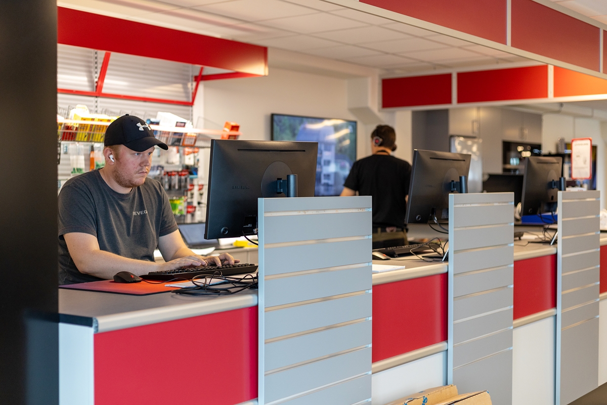
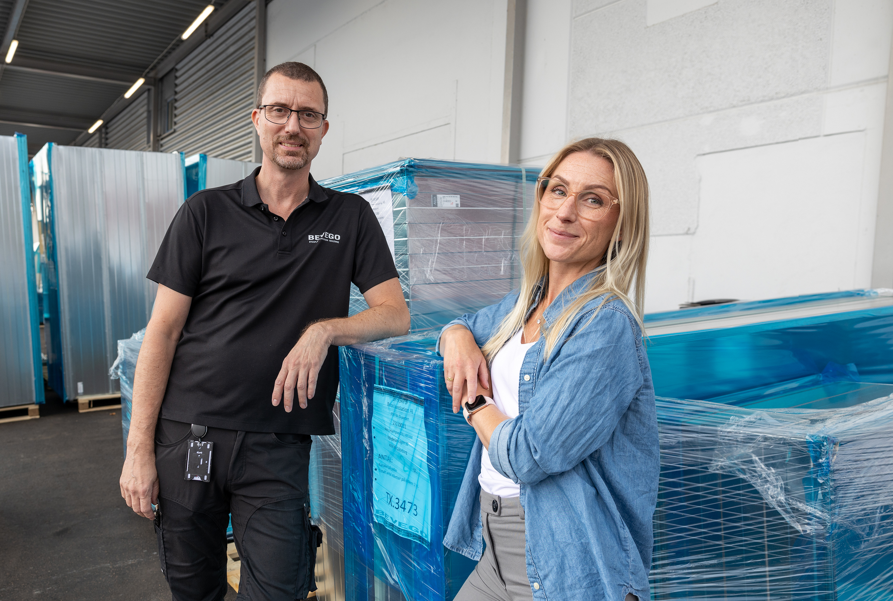
Vi arbetar som ett starkt team där olika kompetenser kompletterar varandra och en inkluderande arbetskultur där olika perspektiv värdesätts.
Samarbete mellan våra filialer, affärsområden och roller gör att vi kan växa tillsammans. Här blir du en del av en arbetsplats där laganda och engagemang är avgörande.
Möt våra medarbetare
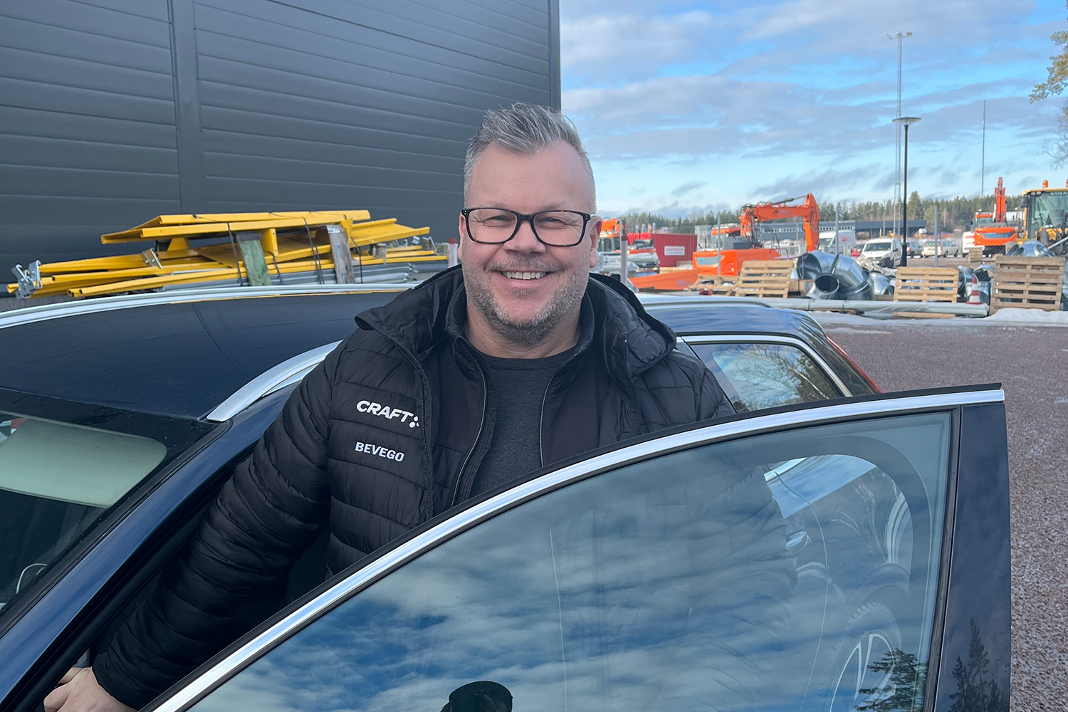
Vad är det bästa med att arbeta på Bevego?
Rekryteringsprocessen
Skicka in din ansökan
Inledande urval
Intervjuprocess
Utvärdering och verifikation
Erbjudande, Preboarding och Onboarding
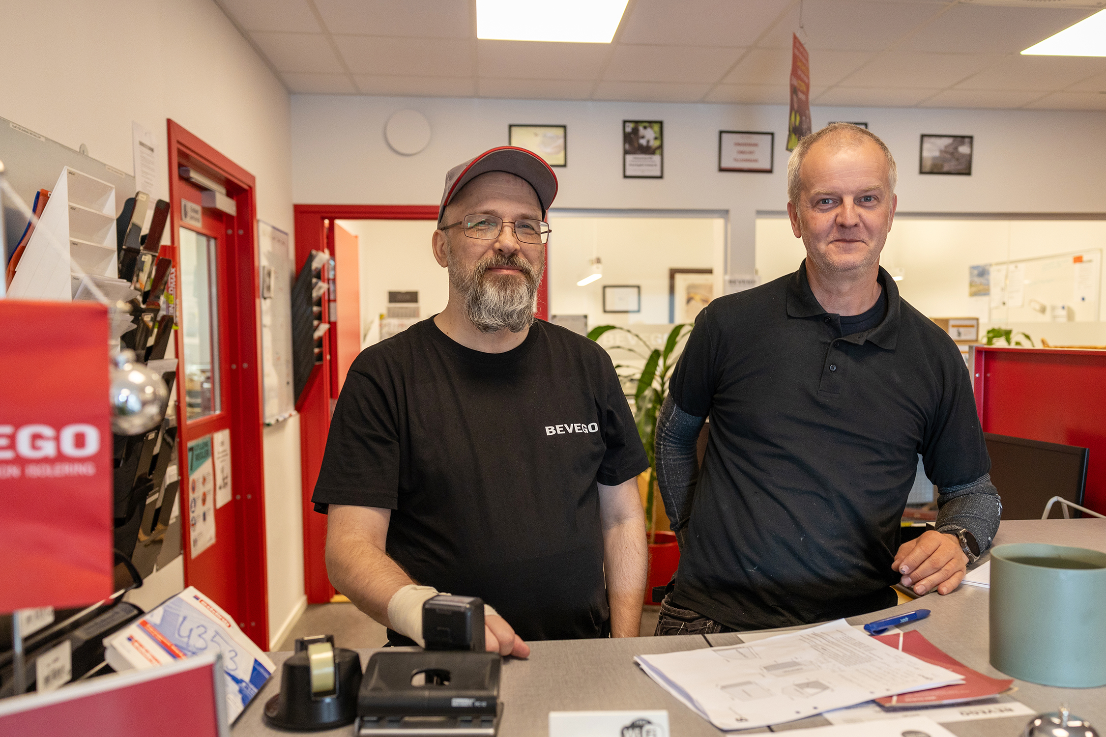
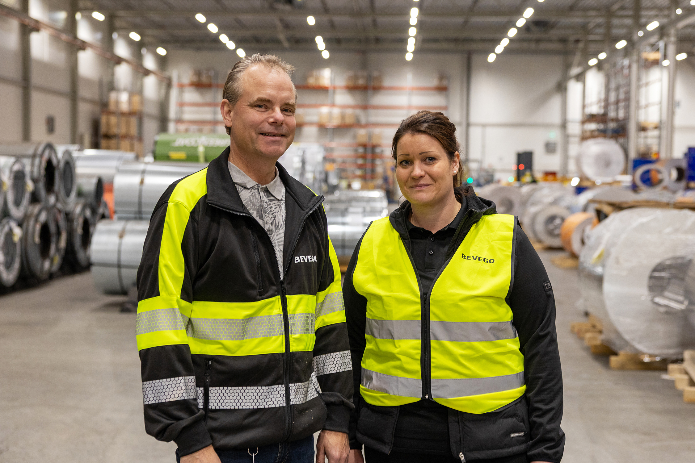
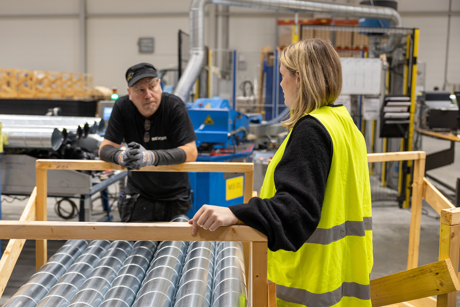
Ett sammansvetsat lag
Alla vi som arbetar på Bevego är en del av ett sammansvetsat team som hjälps åt mellan filialer och affärsområden. Bland våra kunder anses vi vara en mycket tillförlitlig leverantör med gott rykte, något vi är väldigt stolta över. Detta betyder inte att vi kan eller vill slå oss till ro. Tvärtom, vi ska bli ännu bättre! Vi ska etablera oss på ännu fler platser, se till att vårt sortiment ständigt uppdateras och rekrytera marknadens mest kompetenta medarbetare. Är du en av dem?
Att jobba på Bevego innebär stora möjligheter till både karriär och utveckling. Se nedan vilka roller vi har på Bevego.
Roller på Bevego
Filial
Produktion
Sälj och marknad